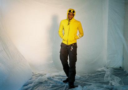
Selected color: PANTONE® 16-0836 TPG
The selected color can be seen as a tint of gold.

I selected this particular colour, because of the exclusivity of it. You rarely see this tint of gold/brown/yellow in fashion.
The gold tone of this color is often represented in my photographies: it reminds me the light of the golden hour, which has been the background of my works many times.
Colour gold is the colour of health, extravagance, richness, and excess, and shares several of the same attributes of the color yellow.
This tint feels somber and traditional but also warm. Because of this, I can style it in multiple ways and can dress it for various occasions.
I would compare the expression of this colour with the Bordeaux colour. This wouldn't be the case If I would have gone for a more brighter tint which would have been less elegant but happier.
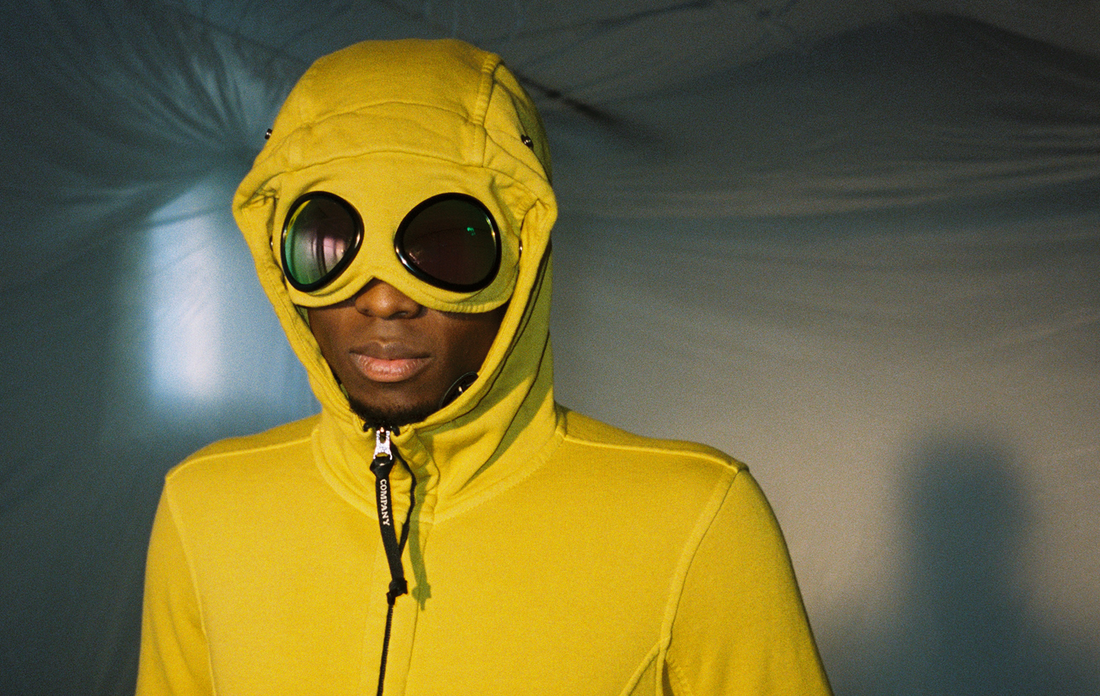
Yellow is not used very often in architecture cause it can make or break the aesthetics of the building. Only a few know how to apply this kind of color well.

When I photograph architecture, I don't necessarily look at colours first, but I focus more on forms and aesthetics of the place/building that I am photographing. However, when architectures use the color yellow they intend to create a sunny, friendly and or soft impression. As you can see in the picture the color adds a stimulating, brightness, coziness feeling to the building.
Images credits: courtesy of Willem Sizoo